Wednesday, April 6, 2011

ASSIGNMENT 2 IN 2011

For Assignment 1 we need to do a poster and the theme is 1 MALAYSIA. For this Assignment 2 we need to do make our poster moving. like stop motion poster. So this is how my poster moving looks like.


My poster is about CLOTHING so I illustrated a different national clothes from other races like Malay, Chinese and Indian. First, I make the Chinese costume for man in a smaller size and then I just make it bigger and bigger. 


Second, the cheongsam comes from the bottom of the poster and down next to the Chinese costume. 


This is how it looks when the Cheongsam down and make a place beside the Chinese costume. 


I also make the same movement for baju kebaya but in different angle. 


I make the effects of Malay costume or 'baju melayu' from small size to bigger size and small size again. I just play with the motion. 


For Indian costume I make it rotating 360 degree from small to bigger size. 


Saree movement I just make it down straight next to the Indian costume. 


I adding my quote one by one at one time. 


I just slide it the text. 


I rotating the text to make it different. 


I played the word MALAYSIAN and I just making it rotate and it become to its position. 


This is the last one for my motion poster. 


my poster. 


Saturday, January 15, 2011

MILK CALENDAR 2012

This is our group work. We were decided to use MILK as our MAIN idea for our calendar. So, I'm work on MARCH and APRIL for our calendar. 


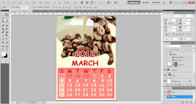
MARCH


First, I put the image of milk spill. The colour of the milk is light colour.  


Second, I add the box for the numbers in the calendar. 


Then, I plays with opacity. 


After that, I put the year of 2012.


Then, put all the numbers and also the date and month.


Then, I highlighted the public holidays(Sunday).


I place one of the image that I took.  


Another image that I captured.


Last but not least, I add a tiny border between the image to make it nice. 
The complete calendar of this month. :)


APRIL

the steps are all the same but I just change the colour of the month. 


DONE! This is my work for March and April. 
hope you like it :)

EXERCISE 2 : PERSONAL PHOTO 2

This is my second exercise doing this personal photo. I used a different photo since Madam Lydia already approved it. 


First, I  Google the Eiffel Tower photo and put in as my background. 


Second, I add tiny star into my background to make it looks more beautiful. I use eraser tool and erase the things that I don't want. 


Third, I add moon that I Google from the internet and put in as my background. For this, I'm using magic wand tool.


Lastly, I add border around my picture and text to make it looks like a postcard. This is my final outcome. ;D


before. 


After.

EXERCISE I : PERSONAL PHOTO 1

I have done my exercise 1 which is I'm doing it when I'm in class with guide by Madam Lydia. This is my first time retouching my photo using Photoshop.


First, I choose vibrance and saturation tool to adjust the colour of my photo. 


Then, I use curves tool to make it balance. 


After that, I use brightness and contrast tool to adjust the perfect colour to my photo so it won't look so dark or pale. 


As you can see, I play with the variation and I chose midtone colour to my photo.


Last but not least, I use paintbrush tool and make my background of the photo in black and white. 


before.


After.